Keeping it simple isn't always easy. Branding with a minimal aesthetic takes some whittling and super critical design thinking, but with the right execution — it can make for striking packaging. If your brand aesthetic favors simple geometry or could use more crafted white space, take some inspiration from these minimal packaging designs with maximum "wow" factor.
This roundup includes inspiration from some of our favorite companies and designers around the web. Unless specified, these designs are not made by Lumi.
The Oliver Cabell brand is all about transparency, and their simple, geometric branding speaks to that. Their canvas bags aren't covered with their name or an obvious logo, but this makes their branding feels more philosophical and curious.


The MØS line of iconography is a simplification of elements in nature. The designers at Backbone used these icons big and small, patterned and solo, across the entire line of packaging — mostly wrapped paper. Just like the name implies, it looks very smart and casual.


This box design is all about type and the often misunderstood typographic orphan. By having some fun with the type placement and focusing on the product name, an otherwise basic box for an otherwise basic hat rack looks sleek and classy. All of these profound packaging choices are made specifically to enhance the aesthetic and function of the product inside.


Sometimes the best route to minimalism is to focus on your glyphs. These Japanese and English characters complement one another, and when they’re stacked on canvas the brand feels really natural. The masking tape and canvas textures with pops of neutral pink make for a lineup that's soft and modern.


When part of your brand identity is a circle, a simple sticker has a whole new meaning. For Vincit Beer, type is used sparingly and is alternated with plain circles. Marco Vincit designed the bottles to be wrapped in paper and sealed with a circular sticker, and the geometric theme plays out over the entire label.


Vincit Beer by Marco Vincit
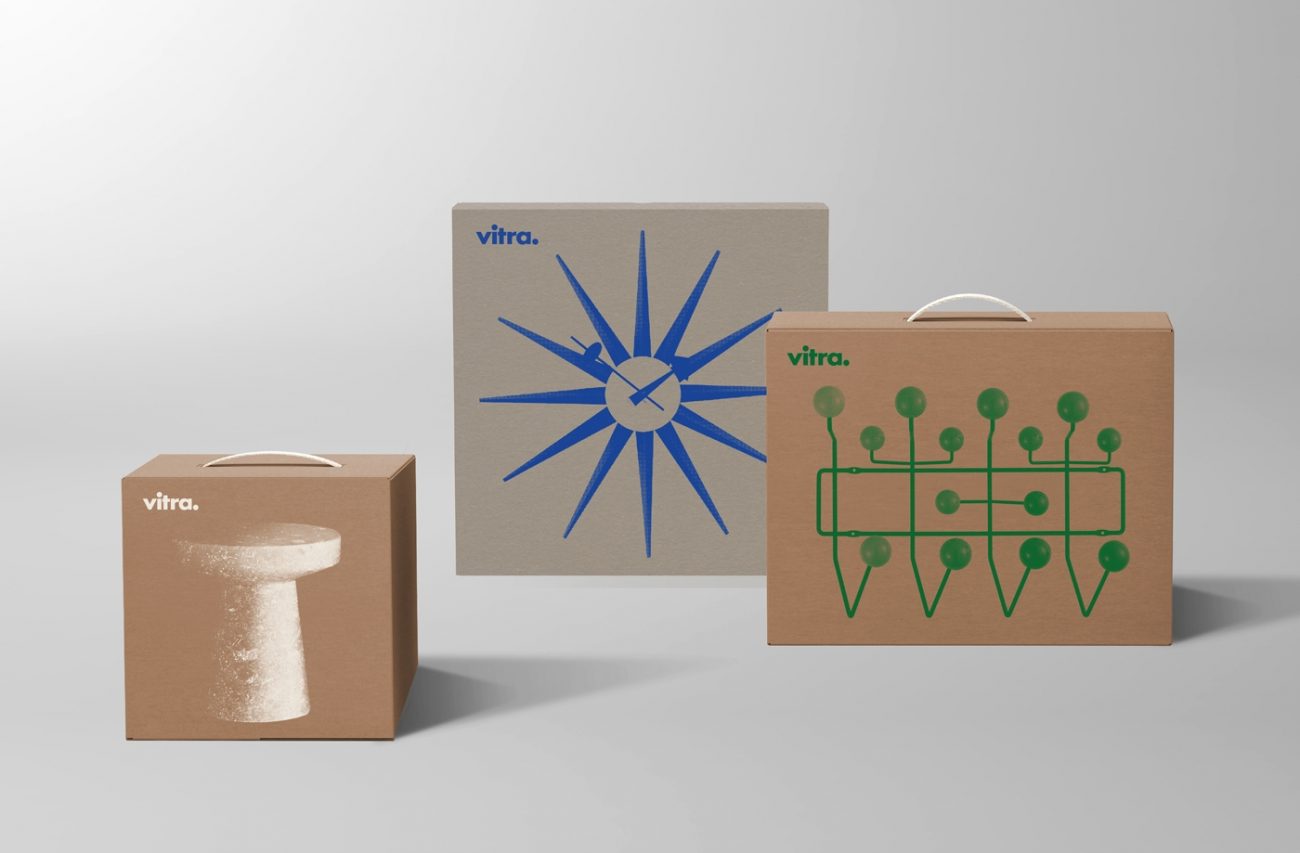
It doesn't get much more transparent than just showing people what's on the inside of the box one the outside of the box. Keeping it kraft with single color printing, Vitra embraces the essential and (much like their Swiss home aesthetic) keeps clutter to a minimum.


